|
So I met this client via another new client at a local open mic night. He is a local beat boxer and was in need of a logo sprucing up. I asked him to show me his original logo to give him an estimate and idea on what I could to do fix it for him. 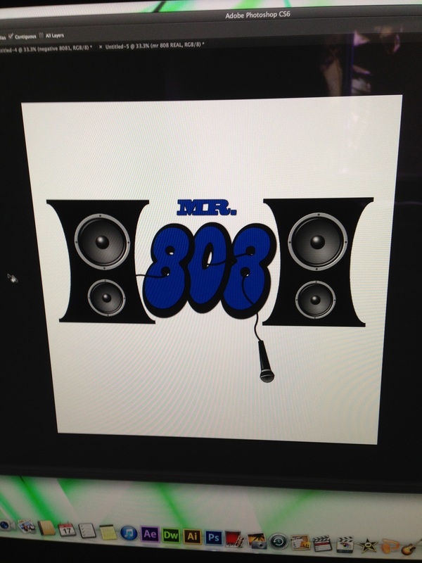
The above is the original logo. As you can see, not much to it, I felt like it was a little too much and not enough at the same time. I didn't feel like the speakers were a necessary element and took away from the actual branding. I also felt the font was too plain for the client. I suggested a couple things, simplifying the logo design, keeping the mic and wire elements, and changing up the font. The client was going for a "cartoonish" look as well. 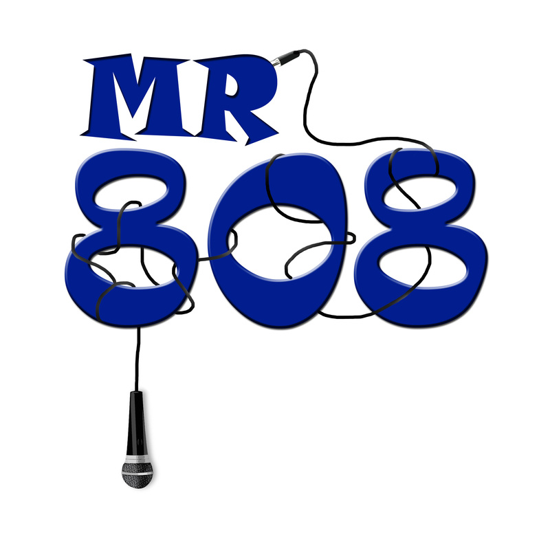
The client like the idea of the mic hanging down from the previous logo. This is the finale result.
1 Comment
|
AuthorInsight into the process Archives
July 2014
Categories |
 RSS Feed
|
art@gccreativedesigns.com
352-232-1949 |